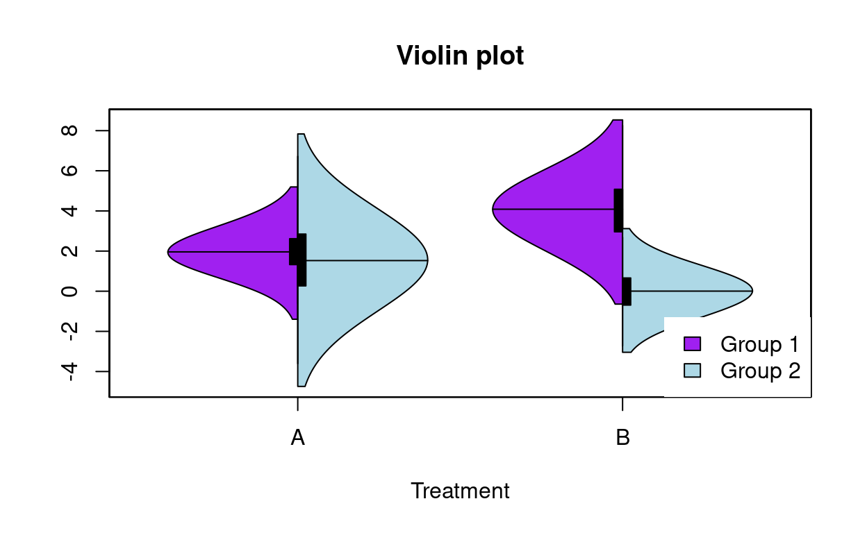
Violin plots are useful for comparing distributions. When data are grouped by a factor with two levels (e.g. males and females), you can split the violins in half to see the difference between groups. Consider a 2 x 2 factorial experiment: treatments A and B are crossed with groups 1 and 2, with N=1000.
Boxplots are often used:
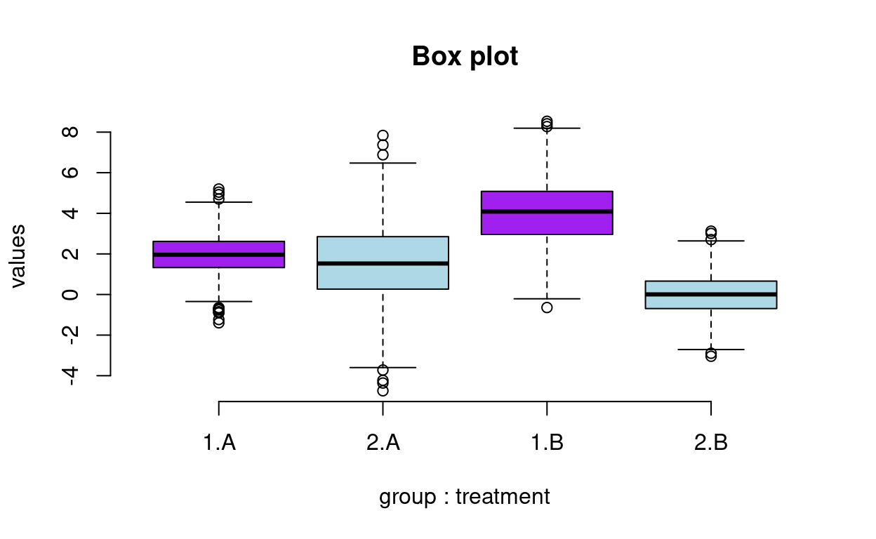
This gives us a rough comparison of the distribution in each group, but sometimes it’s nice to visualize the kernel density estimates instead.
I recently ran into this issue and tweaked the vioplot() function from
the vioplot
package by Daniel Adler to make split violin plots.
With vioplot2(), the side
argument specifies whether to plot the density on “both”, the “left”, or
the “right” side.
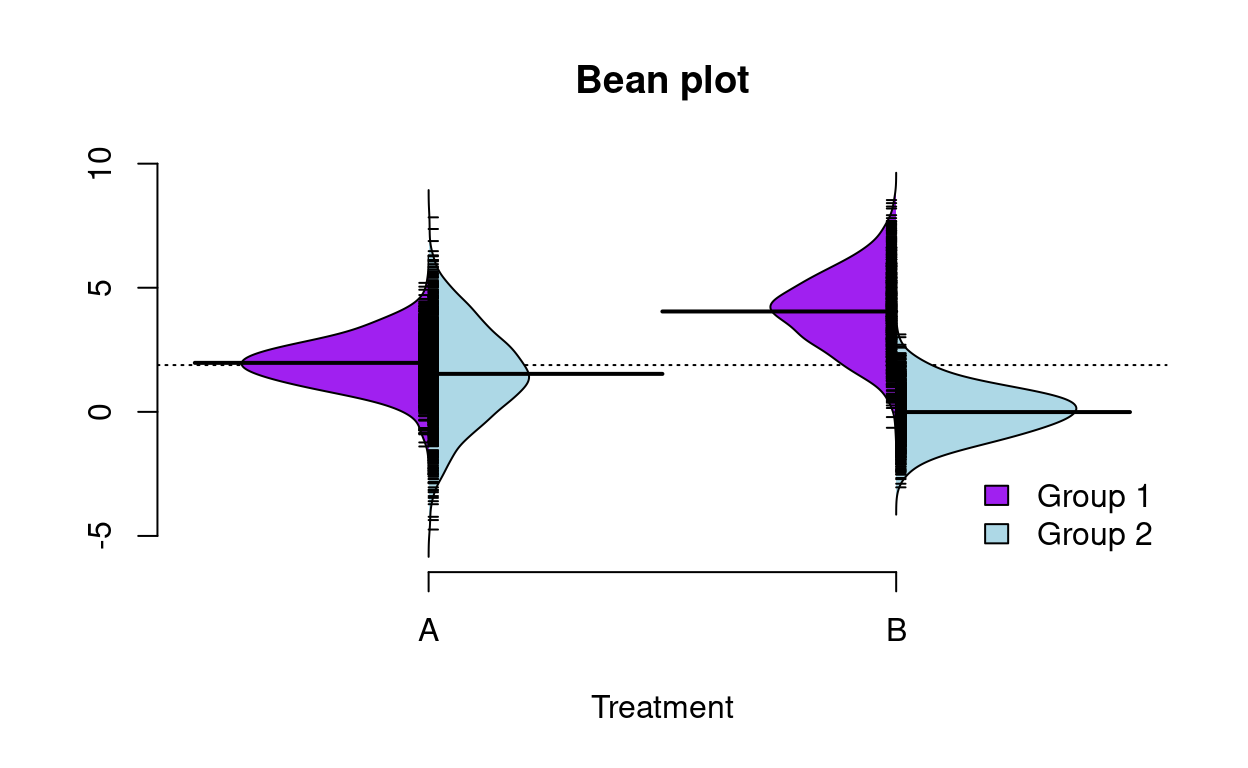
Last but not least, Peter Kampstra’s beanplot package uses beanplot() to make split density plots, but 1) plots a rug rather than a quantile box, 2) includes a line for the overall mean or median, and 3) makes it easier to change the kernel function.
There are more ways than one to skin a cat, and what one uses will probably come to personal preference.