It is easy to present linear model results with vague or unintelligible interaction effects. One way to be vague when presenting interaction effects is to provide only a table of model coefficients, including no information on the range of covariate values observed, and no plots to aid in interpretation. Here’s an example:
Suppose you have discovered a statistically significant interaction effect between two continous covariates in the context of a linear model.
\[ y_i \sim \text{Normal}(\mu_i, \sigma^2) \]
\[ \mu_i = \beta_0 + \beta_1 x_{1i} + \beta_2 x_{2i} + \beta_3 x_{1i} x_{2i} \]
Suppose also that you have decided to present the model results with the following table, and the reviewers requested no additional information:
| Estimate | SE | P-value | |
|---|---|---|---|
| \(\beta_0\) | -0.004 | 0.037 | 0.921 |
| \(\beta_1\) | 1.055 | 0.038 | <0.05 |
| \(\beta_2\) | -0.496 | 0.037 | <0.05 |
| \(\beta_3\) | 2.002 | 0.040 | <0.05 |
| RSE | 0.517 | ||
Without knowing the range of covariate values observed, this table gives an incomplete story about relationship between the covariates and the response variable. Assuming the reader has a decent guess about the range of possible values for the covariates, this is what they can piece together:
# parameter estimates
beta0 <- -.004
beta1 <- 1.055
beta2 <- -.496
beta3 <- 2.002

# reader's guess: range of possible covariate values
x1 <- seq(-5, 5, .1)
x2 <- seq(-5, 5, .1)
X <- expand.grid(x1=x1, x2=x2)

# reader's attempt to know how the covariates relate to E(y)
mu <- with(X, beta0 + beta1*x1 + beta2*x2 + beta3*x1*x2)

require(ggplot2)
d <- data.frame(mu=mu, x1=X$x1, x2=X$x2)
p1 <- ggplot(d, aes(x1, x2, z=mu)) + theme_bw() +
  geom_tile(aes(fill=mu)) +
  stat_contour(binwidth=1.5, color = 'black', alpha = .3) +
  scale_fill_gradient2(low="blue", mid="white", high="orange") +
  xlab("Covariate 1") + ylab("Covariate 2") +
  ggtitle("Contour plot of the linear predictor")
p1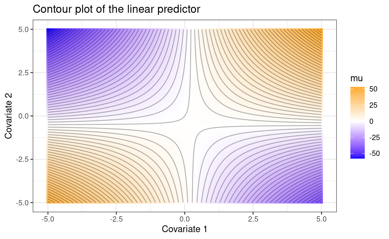
If the reader does not know where the observations fell in this plot, it is difficult to know whether the response variable was increasing or decreasing with each covariate across the range of observed values.
Consider the following two cases, where the observed covariate combinations are included as points.
n_point <- 100
set.seed(1234)
p1 +
  geom_point(data = data.frame(x1 = rnorm(n_point),
                               x2 = rnorm(n_point)),
             aes(x1, x2), inherit.aes = FALSE)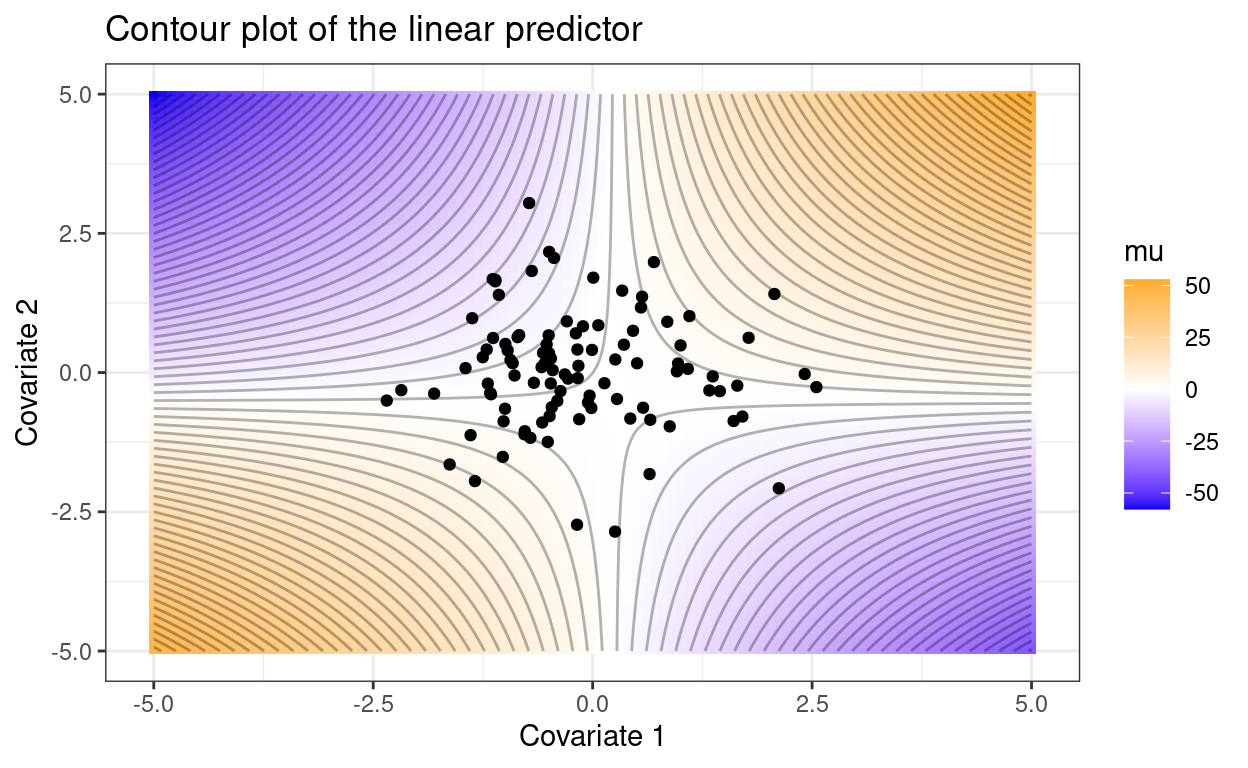
set.seed(1234)
p1 +
  geom_point(data = data.frame(x1 = runif(n_point, max = 5),
                               x2 = runif(n_point, max = 5)),
             aes(x1, x2), inherit.aes = FALSE)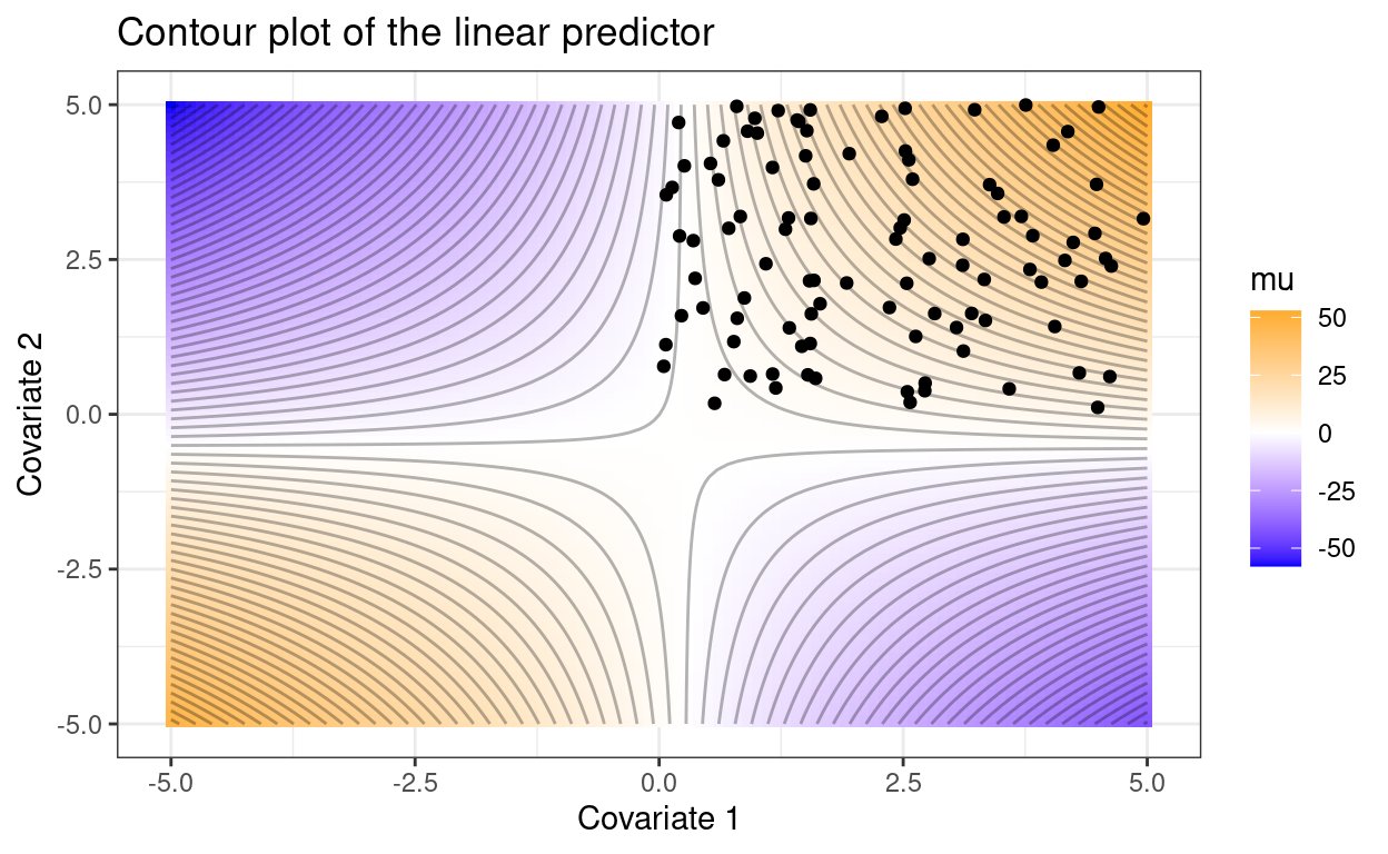
These two plots tell different stories despite identical model parameters. In the second case, across the range of observed covariates, the expected value of \(y\) increases as either covariate increases and the interaction term affects the magnitude this increase. In the first case, increases in covariate 1 or 2 could increase or decrease \(\mu\), depending on the value of the other covariate.
I won’t get into the nitty gritty of how to present interaction effects (but if you’re interested, there are articles out there (Lamina et al. 2012). My main goal here is to point out the ambiguity associated with only presenting a table of parameter estimates. My preference would be that authors at least present observed covariate ranges (or better yet values), and provide a plot that illustrates the interaction.